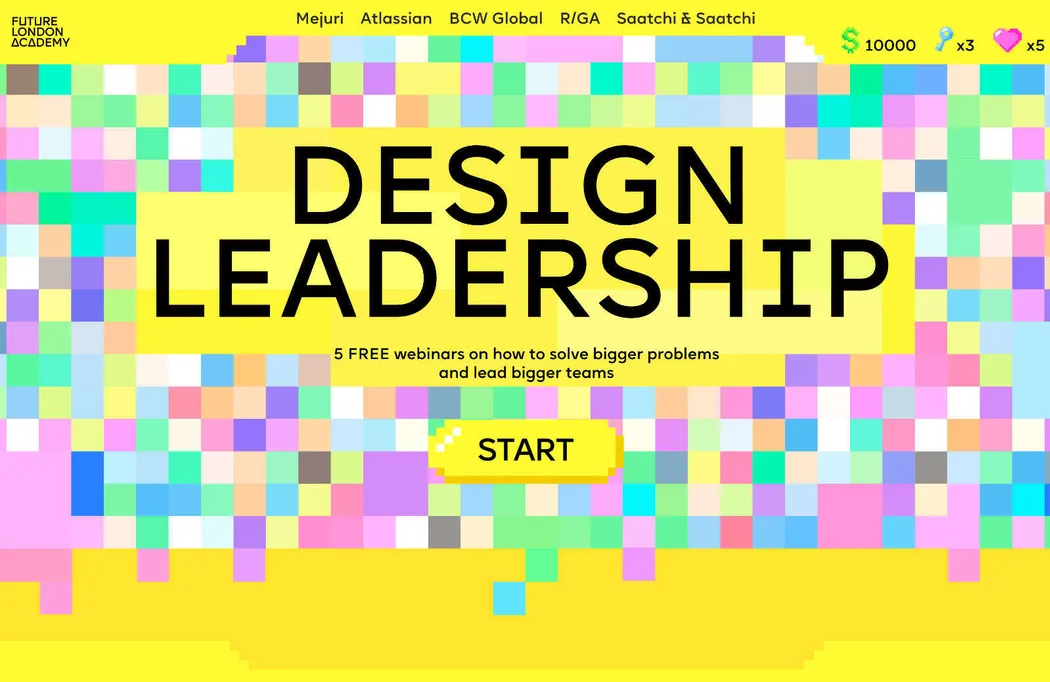
Monthly, we compile a summary of the most exceptional web design work. Recently, vibrant colors are prevalent, a trend for basic graphics is arising, and fashion marketing techniques are being widely adopted by designers.
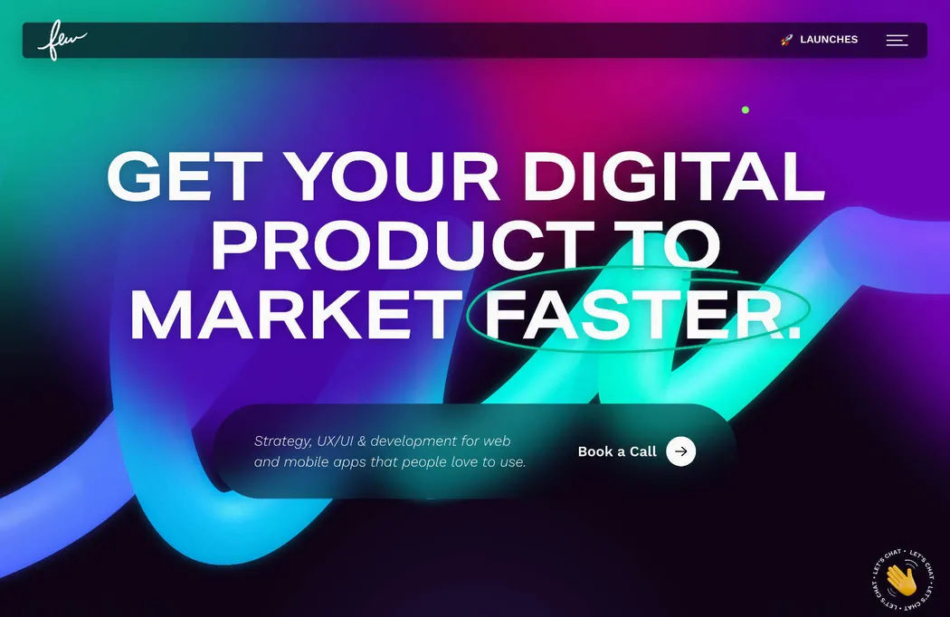
Few
Few is a digital agency with an impressive client roster. Their website showcases radiant gradients and spotlights the benefit of collaborating with their adaptable team model. The site is streamlined, spotlighting a compelling value proposition.
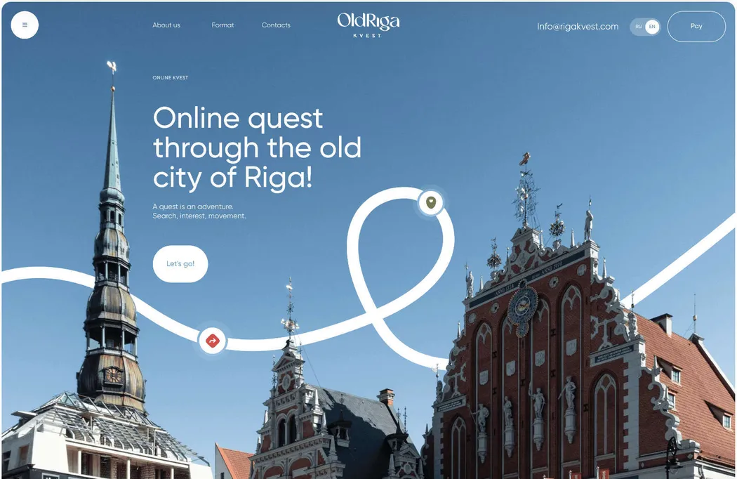
Old Riga Kvest
Have you ever wished to uncover the concealed corners of a city without losing your way, overspending, or skipping the top attractions? Old Riga Kvest enables you to do precisely that in Riga’s Old Town with an innovative, gamified virtual tour of the Latvian capital.
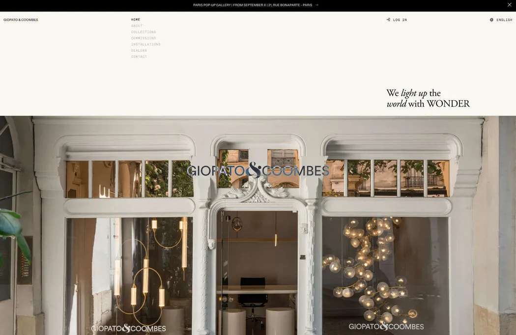
Giopato & Coombes
Giopato & Coombes produces some of the most stunning lighting products available. Their website incorporates intelligent, understated effects, like the filter used on the logo, refined parallax movements presenting product visuals, and pleasing text transitions.
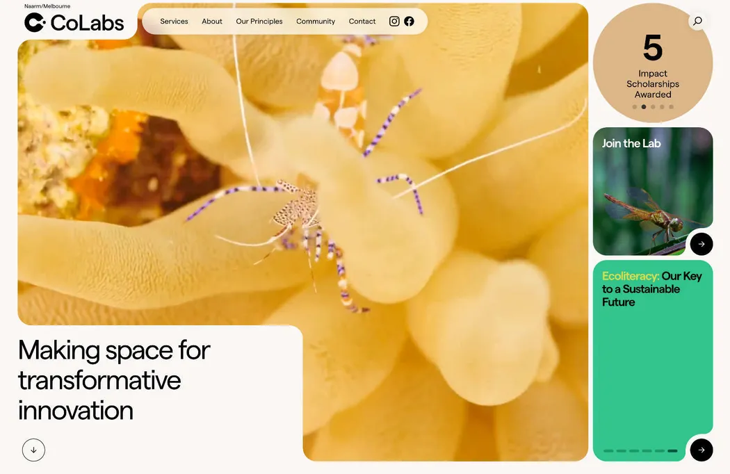
CoLabs
CoLabs establishes and operates collaborative science laboratories focused on biology, similar to co-working spaces for lab research. They utilize remarkable macro video footage and dynamic natural colors to spotlight their specialized domain.
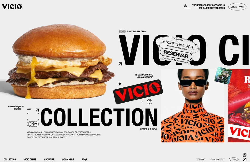
Vicio
If you lean more towards maximalism over minimalism, explore this stellar website for Vicio. It cleverly utilizes fashion brand cliches to market a Spanish fast food brand.
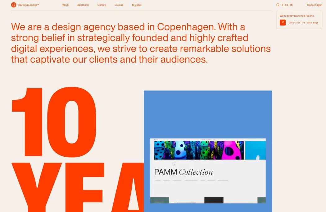
Spring/Summer
Copenhagen-based Spring/Summer is another creative agency embracing the stylistic language typically used by fashion labels. They showcase an impressive portfolio, and the bold, vibrant red color scheme makes a striking statement.
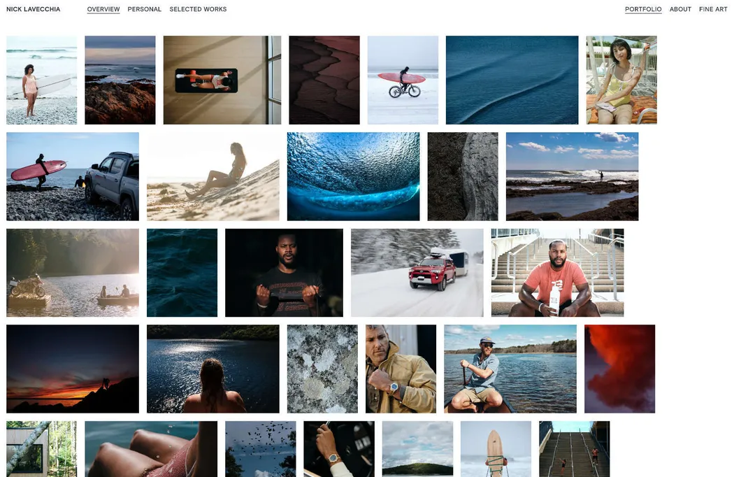
Nick Lavecchia
Nick Levecchia’s website immediately identifies him as a professional photographer. A grid of thumbnails entices you to click through into individual story galleries. It provides the ideal digital presence a photographer requires.
ÖBB History
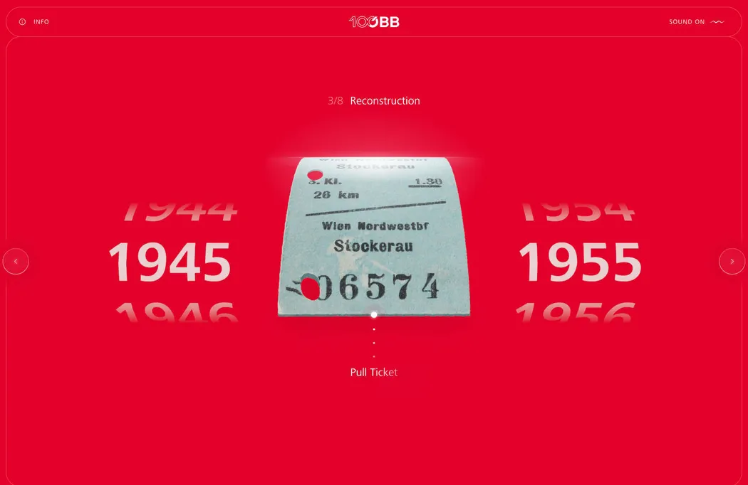
This intriguing website delves into the history of ÖBB, Austria’s national railway service. While not an inherently captivating topic, taking a virtual ticket to various eras transports you on an unexpectedly absorbing journey.
Le Fruit
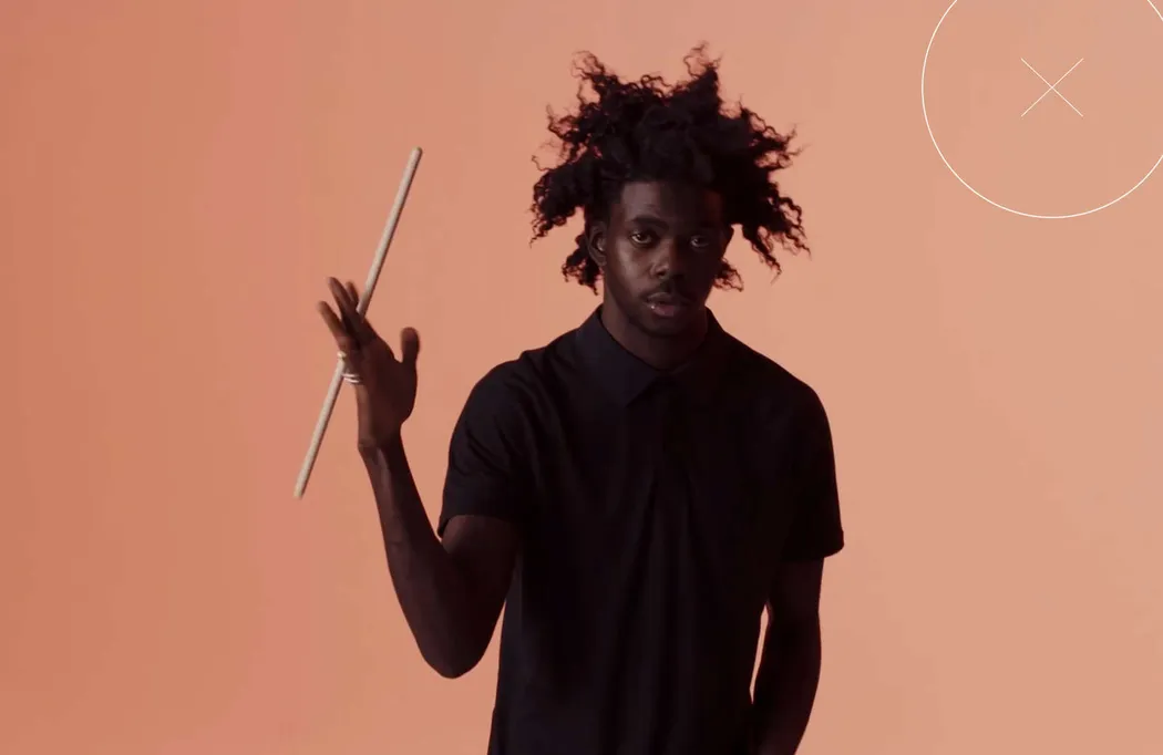
Le Fruit is a vibrant French creative agency with an exhilarating showreel. Distinctly Parisian in style, their portfolio is enjoyable to explore, brimming with phenomenal art direction. Navigating from the reel to their primary website reveals a contemporary Brutalist aesthetic.
Huge
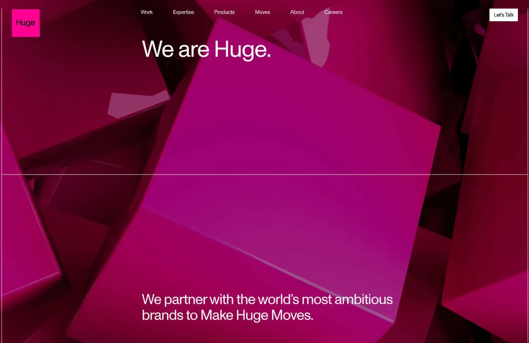
Huge is a creative agency that collaborates with major clients on expansive campaigns. Their website utilizes Pantone’s 2023 Color of the Year, unsurprising since they assisted in unveiling it. The site makes an alluring proposition if you have substantial resources to invest.
Non-Standard
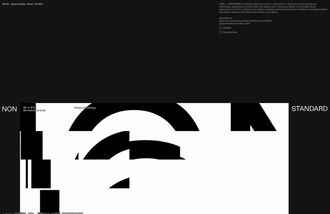
Non-Standard incorporates three prevalent design trends: glitchy motion graphics, dark mode, and a neo-brutalist style that is highly popular with design agencies currently. Their bold, straightforward approach oozes confidence.
Tiles
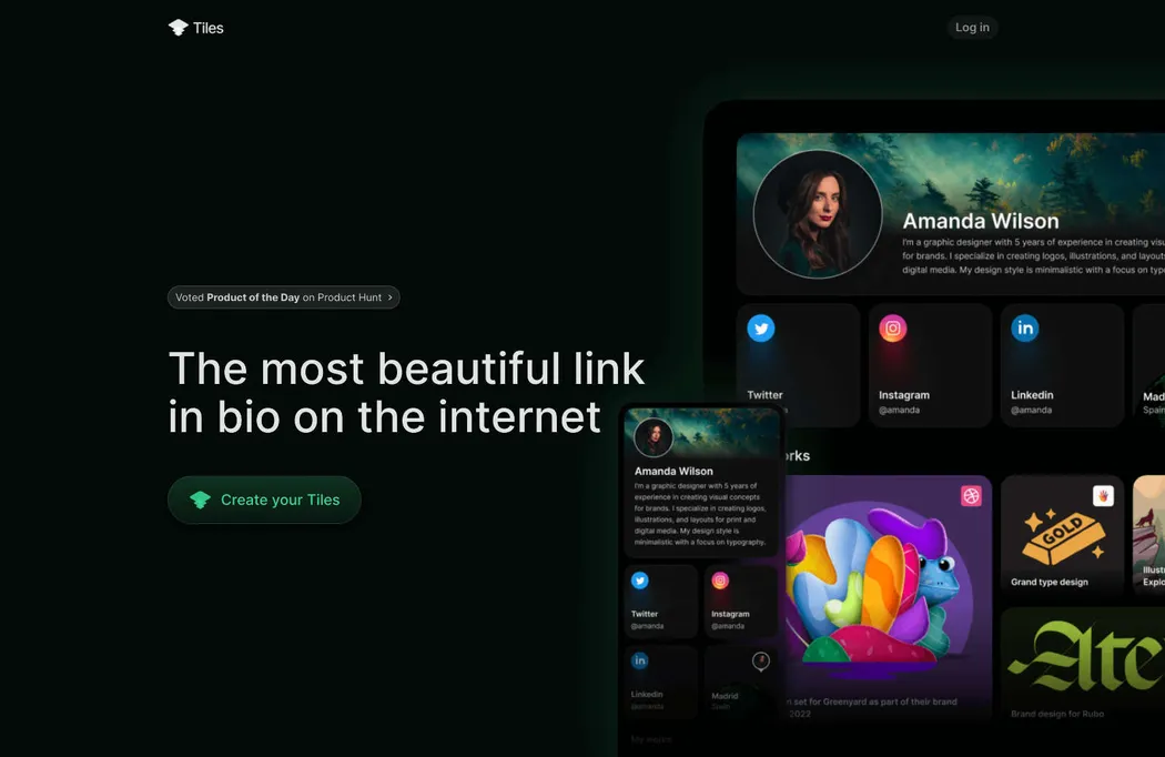
Tiles is a bio-builder tool that empowers you to craft a streamlined landing page showcasing all your important links. Its website effectively demonstrates the creative potential inherent in this straightforward concept.
Knith
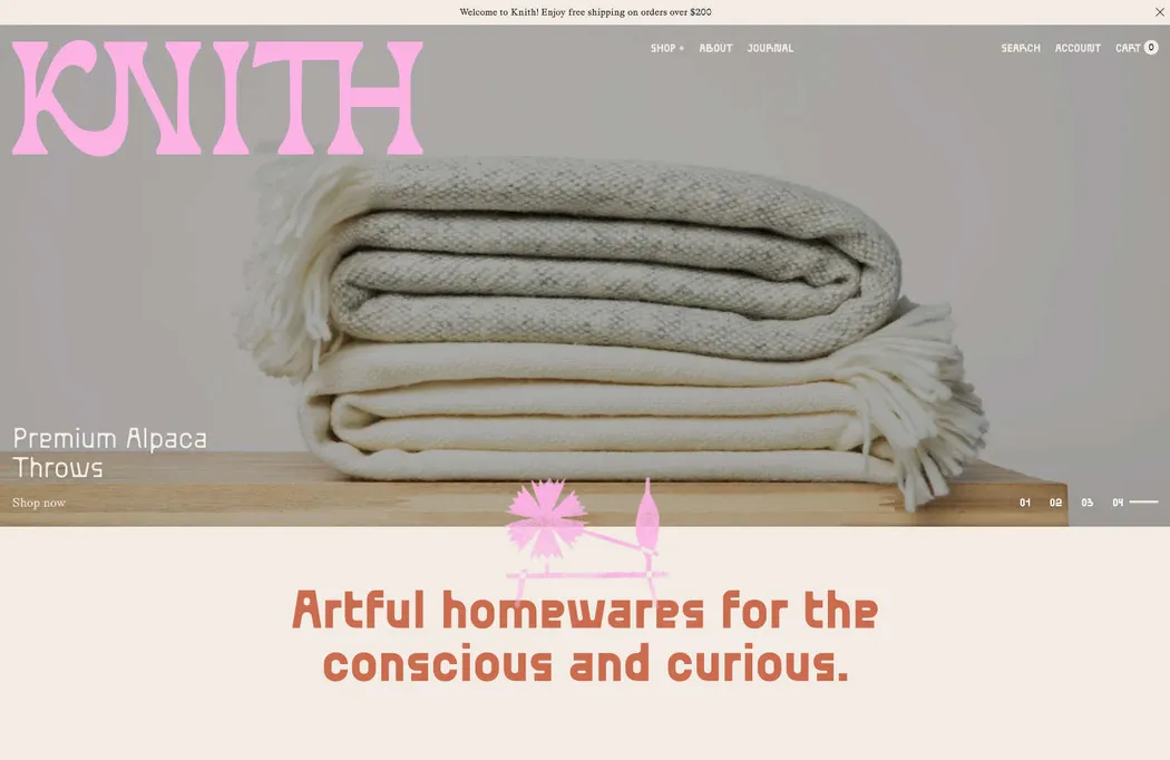
Knith offers exquisite handmade homeware, ranging from blankets to spoons, through its lively e-commerce platform. The website exudes a unique personality, with a bold choice of typography that authentically captures the brand’s specialized ethos.
Mellon Foundation
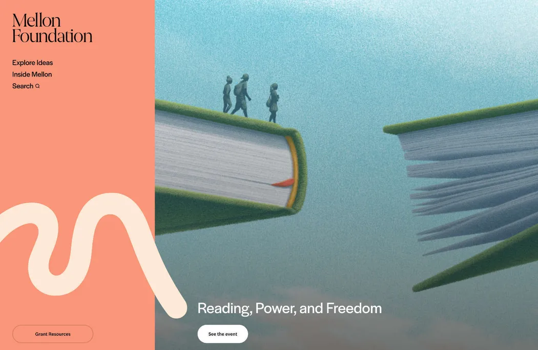
The Mellon Foundation extends grants to arts and humanities organizations, using vibrant shades of pink to emphasize its nonprofit status. Instead of adopting the conventional NGO aesthetic, the foundation opts for a straightforward blog-style approach to showcase its success stories.
Tactic
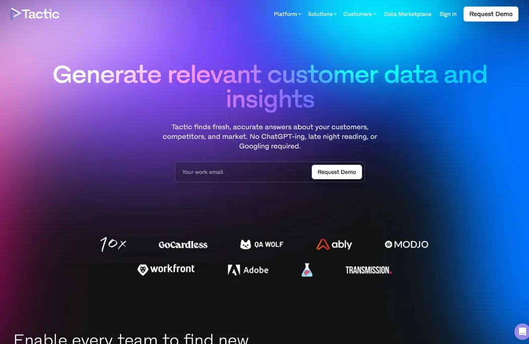
Tactic employs AI and customer metrics ingeniously, but what captivates our attention is its homepage’s captivating use of gradients. These gradients serve as a metaphor, effectively conveying a sense of strength and depth, enhancing the overall visual impact.
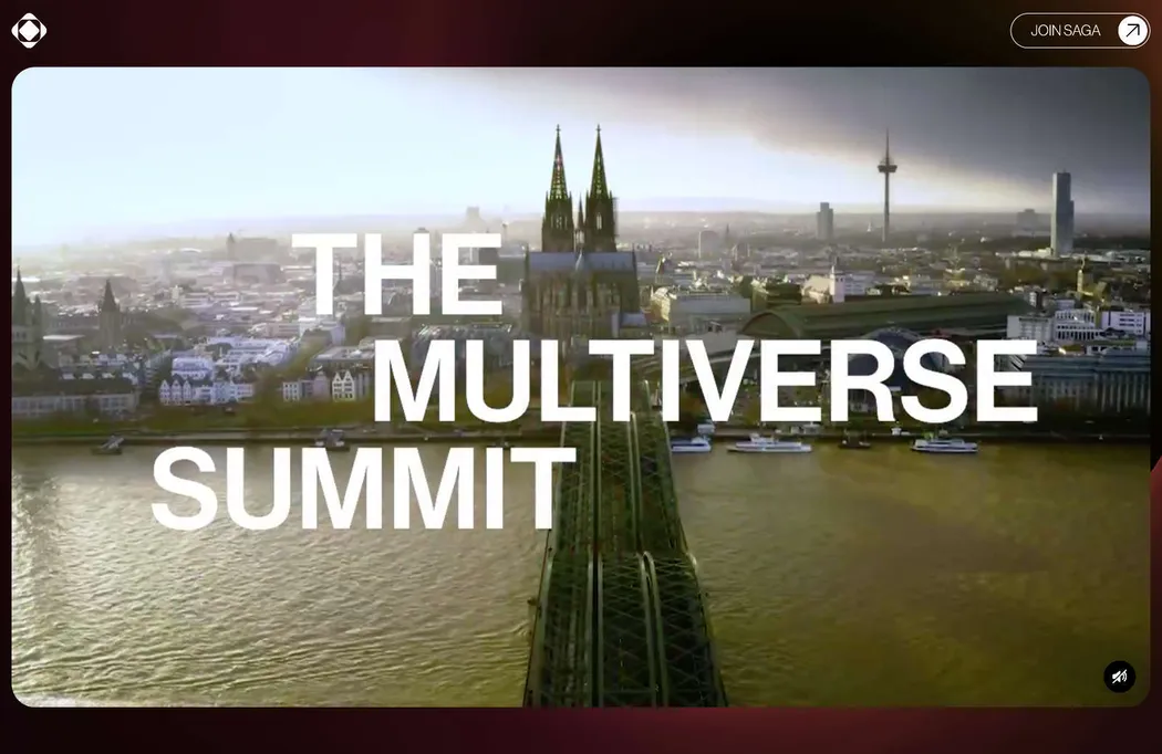
The Multiverse Summit
The Multiverse Summit was a two-day conference dedicated to the world of Web3 gaming. Its website showcases engaging elements like glitch-effect videos, abstract animations, and noteworthy UI intricacies, including the captivating blur-in thumbnails.
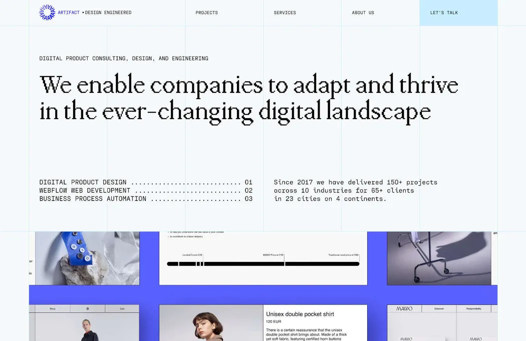
Artifact
Another glimpse into neo-brutalism, courtesy of design agency Artifact. We admire the 90s-style pixelated typography and the ornate grid pattern featured on their website. These elements provide a subtle nod to the strategic underpinnings behind their sleek design work.
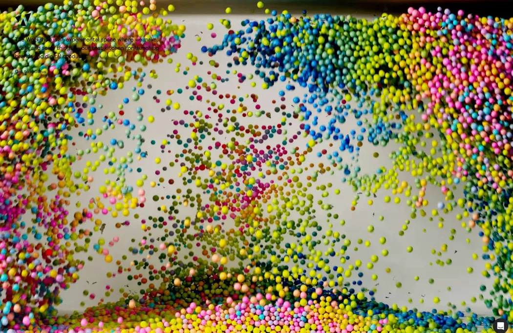
The Workshop
The Workshop is labeled as an experimental hub for constructing and expanding digital products. It boasts a minimalist landing page, highlighted by a mesmerizing 3D logo that unfolds and explodes into a myriad of colorful spheres. Despite its brevity, it leaves a lasting impression.
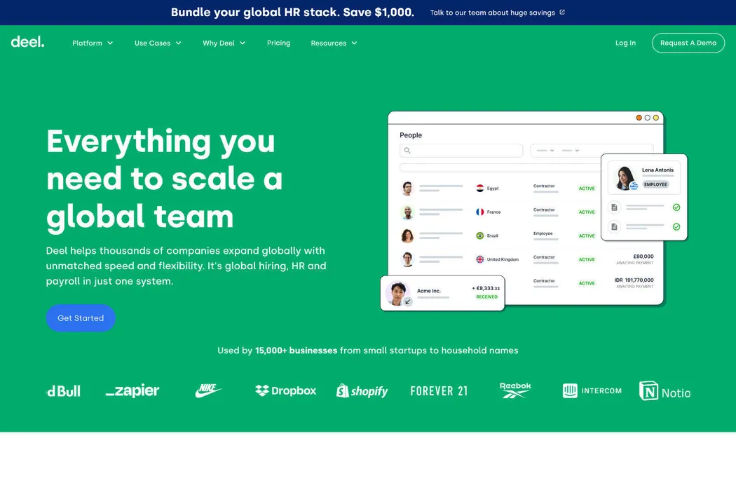
Deel
Deel is a worldwide hiring, HR, and payroll application. Its website is designed to exude a vibrant and multicultural vibe while simultaneously catering to the demands of contemporary corporations that seek reliability and transparency, all while maintaining the energy and innovation typically associated with startups.
Design Leadership
Future London Academy’s free design leadership webinars embrace the trendy pixel aesthetic, infusing it with a vibrant array of colors that imbue the website with a playful Mario game-like atmosphere. For those intrigued by creative leadership, these videos are certainly a valuable investment of your time.
