Before the rise of flat design in the 2010s, software had a more three-dimensional look, trying to imitate the real world. Then came minimalism, which brought cleaner interfaces, better understanding, and more efficient experiences. This was great, and whenever Shopify simplified its product, it saw increased merchant success. Flat design played a role in this.
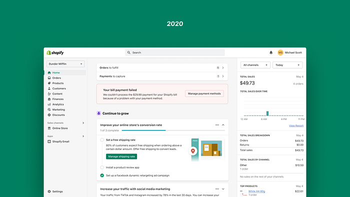
However, minimalism became tiresome for merchants who found Shopify’s Admin experience to be “dull,” “depressing,” and “bland.” Polaris, the design language used by Shopify, contributed to this sterile feeling as it was not optimized for everyday merchant work. Shopify’s Admin is not just a website but a professional tool, and it should feel like it has soul. So the goal was to create a design language that achieved that.
The starting point
In late 2019, two designers, Thomas Jonkajtys and I, joined forces to uplift the Polaris design language. We wanted to make the Admin feel more like a “pro tool.” What does that mean exactly? Here are a few key things:
- A pro tool effectively organizes and presents information.
- A pro tool is highly functional, with clear visuals that aren’t distracting or ornamental.
- A pro tool is responsive and provides interactions that feel realistic.
Ultimately, our design language had to make the product more effective, coherent in the context of commerce, aesthetically pleasing, and able to create moments of joy.
To define our visual design direction, we looked for inspiration in products that spoke the same design language we were aiming for. We sought inspiration from physical products rather than digital trends as the world of merchants extends beyond the screen.
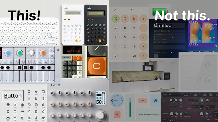
We also delved into photos and recordings from previous research studies to better understand the merchant environment. This helped us gain insights into their workspace, the objects they use, and the familiarity they find in those objects.
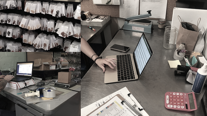
Understanding how users function in their space and offering solutions that make their lives easier is crucial for good design.
Diverging
With a clearer understanding of the design range we wanted to explore, we collaborated with other Polaris designers to broaden and accelerate our exploration. We established certain rules to guide our design process:
- Keep existing behavior and patterns, focusing on evolving the design language rather than the entire merchant experience.
- Design to the extreme, avoiding subtlety at this stage, with the ability to calibrate later.
- Create high-fidelity, high-level designs that can be refined further down the line.
- Design for real merchants, flexing and adapting the design language to their needs.
- Encourage visual diversity and explore various options to avoid falling in love with a single idea.
Our divergent exploration generated many interesting ideas, such as broader color usage, ambitious skeuomorphism, more 3D elements, and the use of blend modes. After covering enough ground, we narrowed down our options and moved on to the next step of defining the design language.
Converging
Two opinionated designers working together poses challenges. We had to build trust throughout the process and figure out how to leverage each other’s strengths. Some decisions were straightforward, like selecting the Inter font that felt appropriate for Shopify.
Other decisions required more fine-tuning, such as finding the right balance between tactile and clean design elements. Through experimentation and iteration, we distilled the elements that complemented each other, striking a balance between dimensionality and simplicity.
Buttons, being vital UI components, went through several iterations to achieve the right feel — tactile but not intrusive, like plastic rather than glass. Icons also underwent extensive design exploration to ensure they were harmonious with the typography and struck the right balance between noticeability and subtlety.
The initial primary color choice of green was reconsidered as it didn’t align well with the professional tone we were aiming for. We opted for black as the primary color, which brought impact and contrast to the interactive states while allowing other colors to have their intended meanings.
Interactions played a crucial role in delivering joy. We wanted joy to come from task accomplishment without being obtrusive or meaningless. We defined a signature motion curve called Snappy, which gave cues to the origin of UI elements and made the interface feel responsive and alive.
Getting buy-in
Reviews with key stakeholders were crucial to turning them into advocates for our work. We approached these reviews with a strong point of view, reacting to feedback by demonstrating the value in our solution. Visuals played a crucial role in shifting conversations from theory to practicality.
To capture the feeling of the new design language, we created a working prototype for stakeholders to interact with and provide feedback. This tangible experience strengthened our credibility and trust.
Make it happen. Fast!
The final review with the CEO was a success, and everyone was excited to ship the new design language as soon as possible. The upcoming Summer Edition 2023 was the target window, which gave us 10 weeks to execute the transformation.
The Polaris team had spent the past year preparing for this moment, working on achieving 90% Polaris mainline coverage. The team optimized Polaris tokens, simplified the release process, created migration and linting tools, and developed a coverage dashboard. They collaborated with other teams to ensure widespread adoption of Polaris components and tokens.
While the initial coverage was at 86.6%, consistent efforts to update the codebase over time paved the way for a rapid transformation within 10 weeks. The implementation required coordination with multiple teams, support for designers and developers, and ensuring high-quality standards were met.
So…what shipped?
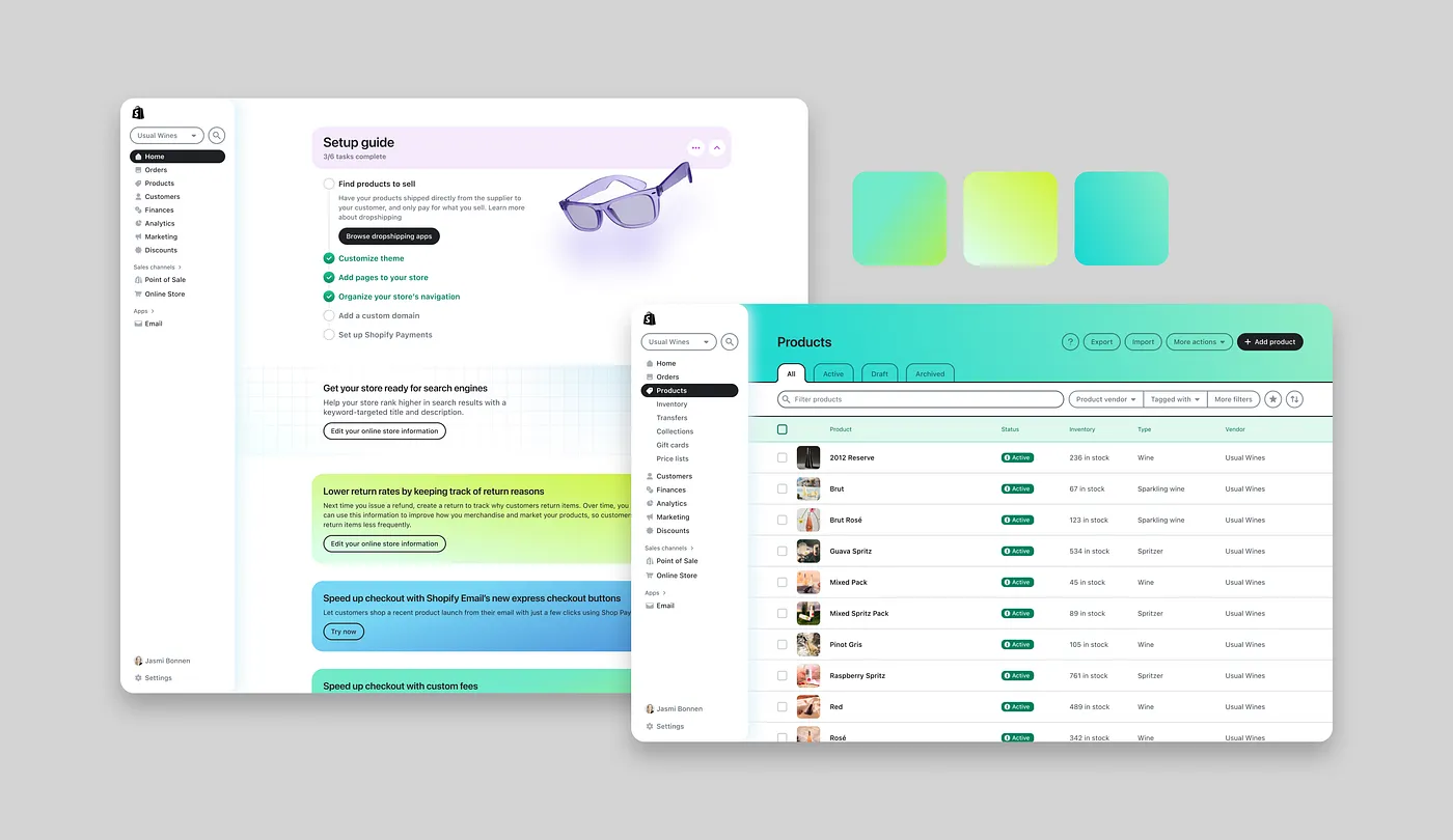
The new design language marked the most significant change to Shopify’s Admin in 7 years. It goes beyond visual updates, incorporating tactility and depth to mirror the tools merchants rely on in their daily operations.
Efforts were made to bring satisfaction and joy to merchants’ journey while maintaining a focus on efficiency. The new design language included reduced text sizes for better information density, leaner use of icons for intuitive navigation, a vibrant color palette, engaging interactions with the UI, and improved typographical legibility.
Before shipping the new design language, temporary access was given to several merchants for feedback. Overall, the new design language was well-received, with praise for its familiarity, refinement, usefulness, and cleaner design. The attention to detail and incremental improvements created an enjoyable experience for even the most mundane tasks.
Continued evolution of the design language is necessary to ensure that Shopify’s Admin remains the best tool for merchants to run their businesses. Updates and evolutions will roll out alongside ongoing feedback from merchants.
This journey wouldn’t have been possible without the contributions of the Polaris team. Their dedication, technical expertise, and commitment to quality turned designs into a tangible reality.
While chaos and messiness often accompany the behind-the-scenes process, the collaboration and alignment of diverse actors result in a remarkable production. The ultimate goal is to empower entrepreneurs with the necessary tools to achieve their goals.