Why Positive Colors are Important in Web Design
When it comes to design, optimism and positivity have more than just a cosmetic impact. These elements play a functional role, affecting user behavior and brand perception.
Positive design contributes to a positive user experience (UX), leading to increased engagement and potentially improved metrics. When your design is inviting, it encourages users to spend more time and interact more with your content. Positive design also influences user psychology, creating an emotional response that becomes associated with your brand.
The aesthetic-usability effect is an important principle in user experience design (UXD). It suggests that users are more likely to perceive aesthetically pleasing designs as easier to use compared to less visually appealing designs, even if the more attractively designed system is not necessarily simpler.
In the context of color in web design, this means that a visually appealing and optimistic color scheme can enhance user experience, increase engagement, and improve conversion rates.
Warm Colors in Web Design
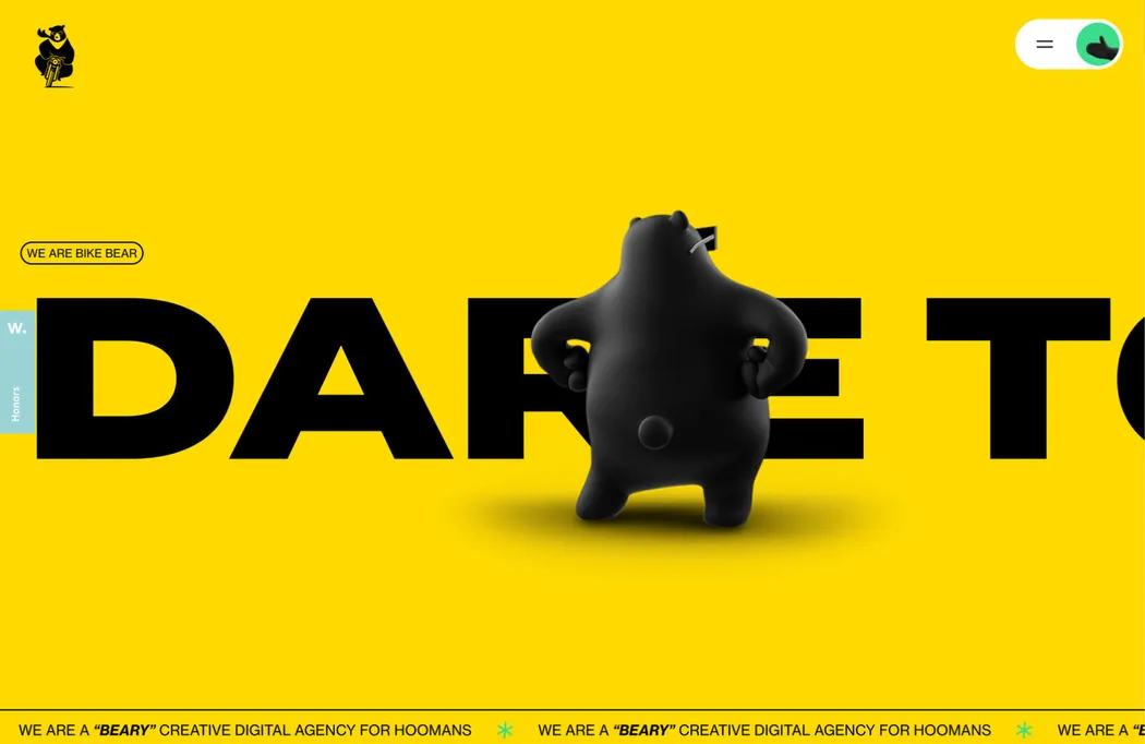
When it comes to positive colors, warm colors like reds, yellows, and oranges immediately come to mind. These colors attract attention and evoke emotional responses, creating a vibrant, uplifting, and energetic atmosphere on a website.
Red is often used for calls to action because it catches the user’s eye. In some cultures, red symbolizes passion, urgency, and excitement, motivating users to take action. However, caution should be exercised as too much red, especially primary red, can be overwhelming.
Orange can be a good alternative to red as it combines the commanding nature of red with the natural happiness associated with yellow. It is often linked with creativity, enthusiasm, and friendliness. Orange is a popular choice for children’s websites, creative agencies, or any brand aiming to convey a sense of fun and energy.
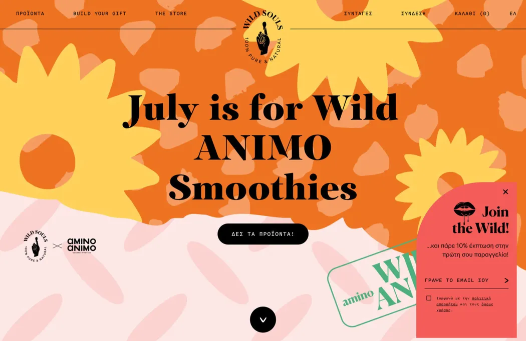
Yellow elicits a happy response as it is often associated with sunshine. It is a popular choice among designers, but it should be used cautiously as yellow can produce poor contrast against white, leading to usability issues.
Warm green and warm blue are other options within the warm color range. By adding yellow to green or a touch of red to blue, you can create inviting and cozy atmospheres or vibrant and dynamic tones.
Fresh Colors in Web Design
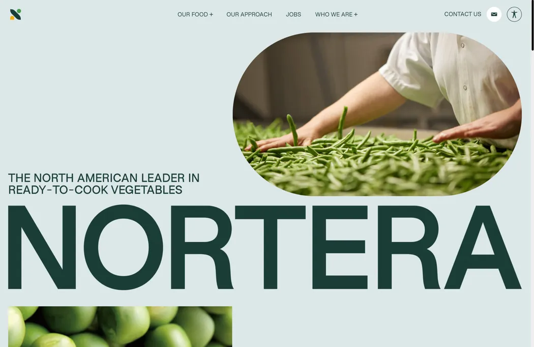
Another way to create optimism and positivity through color is by using fresh hues, typically falling within the green and blue spectrum, and all the variations in between.
Green signifies growth, vitality, and nature in most cultures. Its tranquil and reassuring qualities make it an ideal choice for brands associated with health, wellness, and environmental consciousness. Green can range from vibrant yellow greens that evoke energy and vibrancy to darker leafy greens that create a more lush and soothing feel.
Blue is another popular choice in the fresh color palette. It conveys feelings of trust, reliability, and calmness, making it a favored choice for corporations aiming to establish trust with their customers. Depending on the shade and saturation, blue can evoke various emotions, ranging from deep navy tones that are serene and contemplative to sky blue that is refreshing and invigorating.
In between green and blue, there is a wide range of dynamic hues to experiment with. Colors like turquoise and teal combine the growth and wellness of green with the tranquility and trust of blue, making them perfect for brands seeking to merge innovation, creativity, stability, and reliability.
Muted Colors
While we’ve discussed colors with a high level of saturation so far, another approach is to use a muted color scheme. Pastels and soft tones evoke positive energy and have the ability to create a serene and peaceful ambiance.
Muted pinks, peaches, and caramel tones work well for brands aiming to convey tranquility, wellness, and positivity, such as those in the self-care sector. These subdued colors don’t overpower the design and allow other elements on the webpage to stand out.
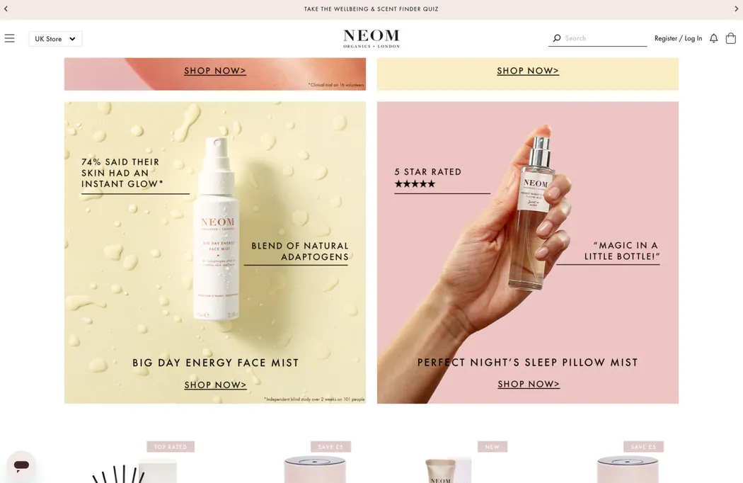
Incorporating muted colors in web design requires a careful balance. It’s critical to ensure that the website remains engaging and visually appealing despite the softer color palette. Pairing muted backgrounds with bold typefaces or dynamic images can create a striking contrast that piques visitors’ interest. Additionally, using gradients of muted tones can add depth and dimension, giving the overall website a sophisticated and modern appearance.
Combining Colors Effectively
The key to effective color combinations is contrast. Try pairing a warm or fresh color with a softer, muted tone. This allows you to create a sense of positivity without overwhelming the design with too many bright colors.
For example, a warm orange accent can be paired with softer beige or cream shades to create a warm and inviting color scheme. Alternatively, when aiming to convey freshness and vitality, pairing a bright green with a softer blue can evoke feelings of growth and tranquility.
Remember that the best color combinations are those that align with the brand’s personality and message. Always consider the emotional associations of your color choices and how they contribute to a positive user experience.
Conclusion
Selecting positive colors in web design involves understanding the brand, knowing its audience, and triggering the right emotions. Whether you choose vivid hues or softer tones, strategic color pairing can enhance the appeal of your design.
Positive colors like warm hues, fresh blues and greens, and muted pastels help create a positive vibe, enabling deeper emotional connections with your audience.